Eurostar Snap discovery & redesign
The problem
Eurostar Snap, a sub-brand of Eurostar, had been launched as an experiment by an outside agency years ago; Customers were still using the site to buy tickets, but there were many known usability issues.
I was brought in as UX lead for a redesign, but soon discovered the problems ran deeper than the interface. There was a lot of tech debt, no research had ever been conducted with customers, and analytics hadn’t been implemented; the product also lacked a clear vision, with different stakeholders holding conflicting views on what it was meant to achieve. This was reflected in the proposition itself--I quickly learned that it didn’t make sense to users, and wasn’t necessarily useful to the audience it was aimed at.
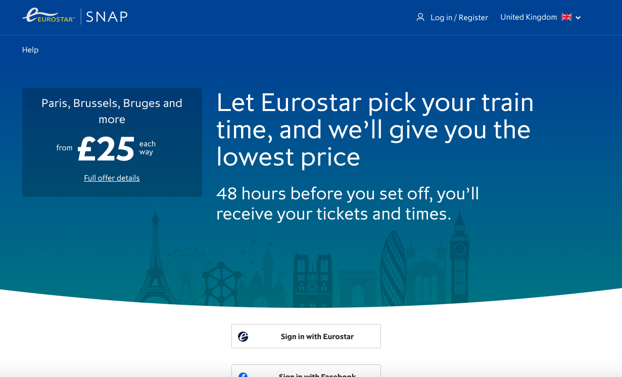
 The Snap homepage when I joined the project
The outcome
Taking a dual track approach, I worked with the Snap product team, the data team and stakeholders to deliver near-term fixes alongside longer term discovery, taking a step back to see if we could improve the proposition as well as the interface. I ran a kickoff workshop to bring everyone together to map out goals and knowns and unknowns; then ran multiple rounds of qual and quant research with the team to understand the problem space and test assumptions and new proposition ideas.
This led to improved ways of working: for the first time, there was data about what was going on, and team and stakeholders were on the same page about current and potential users, what was happening on the site, and what the big opportunities existed. (Not just an improved customer experience - by collaborating more closely we also hit on an opportunity to improve the backend pricing process, saving the pricing team time.)
Not only did we end up shipping short-term improvements to the website and internal pricing tools, but the work from the discovery track has led to a product strategy backed by data, and a redesign optimised to hit new metrics. The team is implementing the redesign in stages to monitor impact; once it’s ready, they can begin testing hypotheses from the “learning backlog” I created with the team, based on discovery findings.
My process
Assessing the current state of play
I met with product owner and developers on the team to understand current goals and issues, and learn about our stakeholders.
To get a sense of the current experience for users, I put the site up on usertesting.com. I invited the whole team to join me to watch the videos, and we mapped out the pain points in the user journey together.

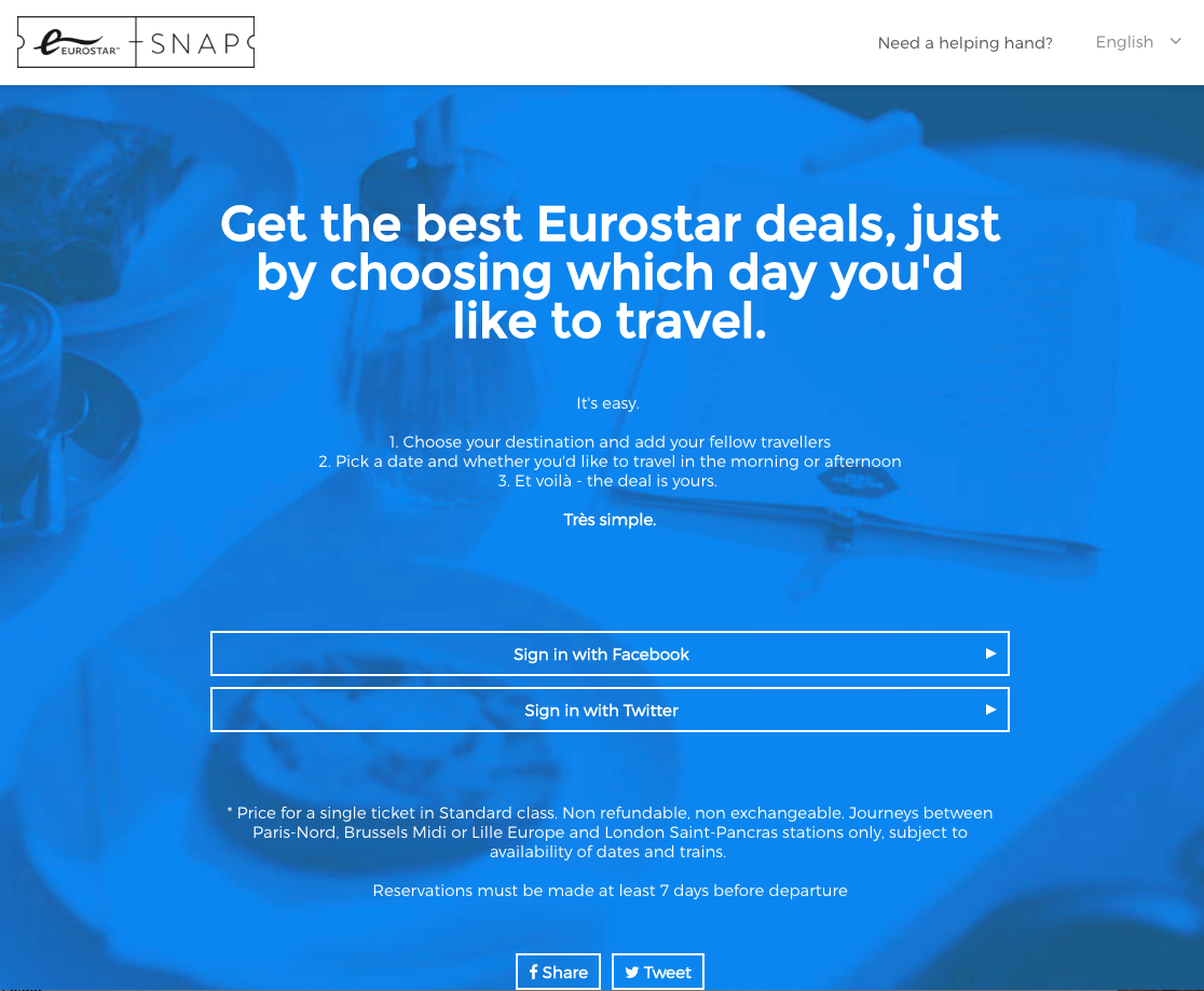
 Just a few of the usability problems we spotted
Discovery kickoff workshop
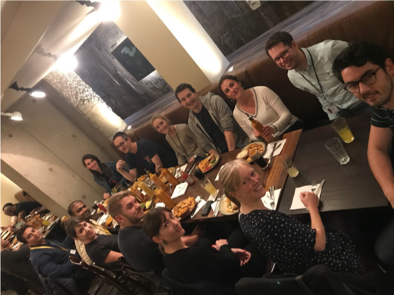
I invited the whole team, along with all of our stakeholders, and outside experts from different departments - from revenue to social media to ticketing systems. (Above: a few of us on our well-earned lunch break!)
I ran an activity where we captured all the different goals and target audiences for the product, and attempted to prioritise them. We then pooled our knowledge to create a map of the current customer experience as well as how the site is managed internally, capturing pain points, assumptions and questions along the way.

Goal-setting exercise
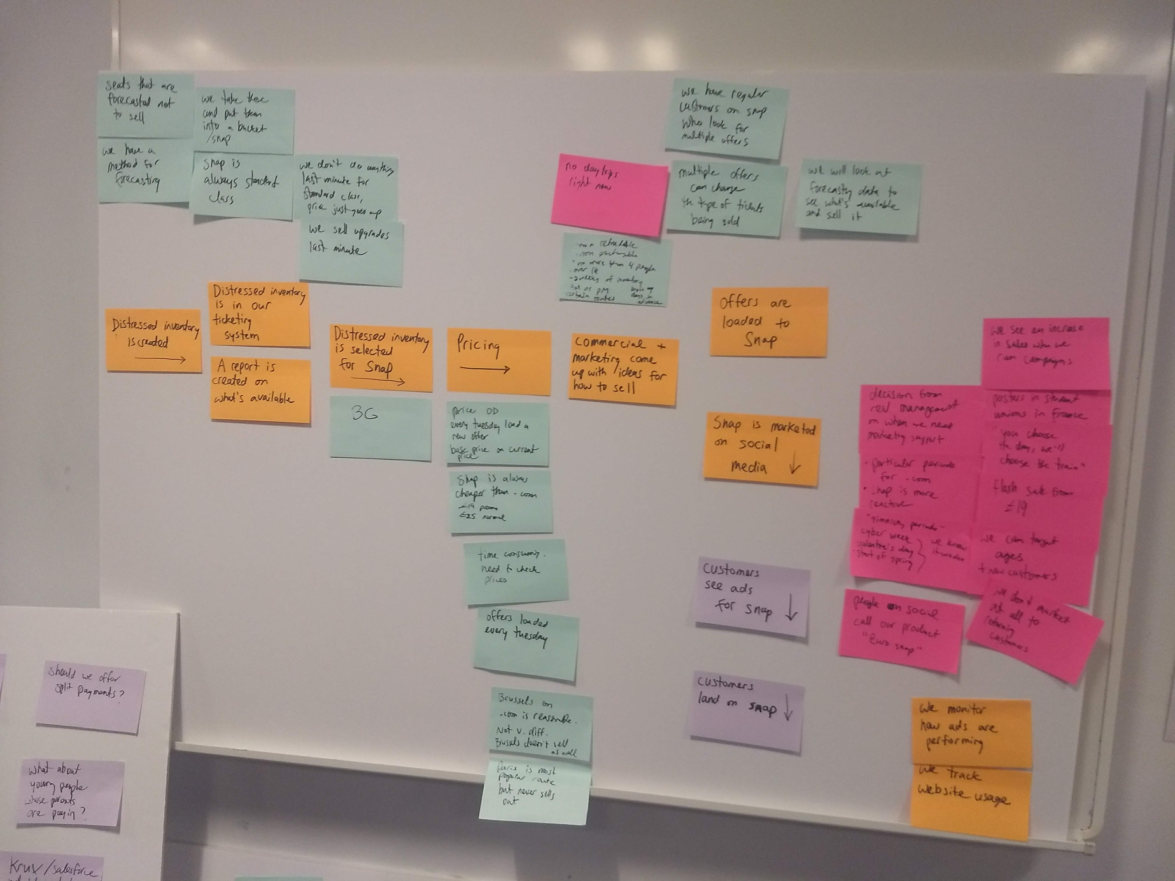
Map of our internal pricing and ticket selling processes
 Map of our front-end customer journey
By the end of the workshop, we had prioritised a big question around audience and purpose of the product, which we could now answer through research to form a product vision and strategy. I planned timeboxed research activities to help us answer our big question, alongside delivering more urgent improvements that were already in our backlog and would affect upcoming ticket sales.
Research, round 1
To answer our big question about audience, I recruited two different audience types for a round of depth interviews. I spoke to them about their habits, and watched them use a new iteration of the site, as well as a competing site; team and stakeholders observed every session.
We learned that some of our big assumptions about audience and audience needs were wrong, and that our product wasn’t as useful as we thought to those it was aimed at--these audiences had some major existing habits that weren’t being considered in our product.


 Research learnings challenged big assumptions about our product and audience
I also worked with the team to start making use of analytics, getting as much of a picture as we could about what was happening on the site now. I built relationships with analytics and data science and worked to get the team to implement an A/B testing framework on the site for the first time. As we delivered short term fixes to aid upcoming ticket sales, we were able to better measure impact and learn more about our existing customers.
I pulled all of our qual and quant learnings together and identified the “jobs” our customers were really trying to do; I used these as a basis for recommendations on new directions the product could take. The team and I presented these findings to stakeholders and won their support; I led a proposition brainstorm with the team and stakeholders based on our learnings.
Research, round 2
I prototyped our chosen propositions, and tested them with customers who were new to the Eurostar brand. The prototypes were rapid and imperfect - the goal at this stage was to learn about what direction the product should take, as opposed to usability.

The “Open Snap” proposition proved a big hit, and it seemed like we’d hit on a much bigger opportunity than we were expecting - there were strong signals we could convert new budget-minded customers to not just Eurostar Snap, but Eurostar. This pointed to a different product strategy than we’d been assuming, as well as new metrics we should be tracking.
I proposed a series of hypotheses to test based on what we’d learned, which would see us investigate a new direction and some major new features; we again used data to make the case to stakeholders, and won support.
Redesign! (Not live yet, stayed tuned)
As the current site was in such poor shape in terms of UI and the back end, it made sense to rebuild from the ground up despite our recent short term fixes. I worked with the team to create the simplest possible new design to provide a basic level of usability and support the new proposition we wanted to test further; we made the design flexible, so that it would be easy to alter the proposition itself in future depending on what we learned.
I wireframed and created a UI, borrowing patterns from Eurostar.com wherever possible, for consistency and so that we could get to a base level of usability as quickly as possible. I paired with a visual UI designer and we did a light rebranding to better position Snap as a Eurostar sub-brand.
Previously, we’d seen users confused by our proposition, so along with trying to make the new proposition feel more Eurostar, I also worked hard to improve the microcopy.
Throughout the process, I ran six rounds of rapid usertesting.com usability tests to track whether our new designs were succeeding. Our measure of success was whether or not users were confused about the proposition by the end of the task.
 Usability testing results from our third iteration, capturing users’ confusion levels at different stages of the task.
After some rapid iteration, we had a design where 93% of test participants understood the proposition and that Snap was a Eurostar brand.
Rather than relaunching as a big bang, we’ve broken the implementation of the new design into parts, and will track impact on our brand new metrics. We’ve also got a backlog of hypotheses to test live based on our research following the redesign. Our re-use of patterns from Eurostar.com has also sparked Eurostar’s first design system.
New homepage with simplified copy; up front login will be removed in a future iterationDesigns are being implemented in stages and aren’t fully live yet. Curious to see wires and mock-ups? Get in touch.
Improving business processes, not just the site
Our close collaboration during the discovery process brought us much closer to the Eurostar pricing team; we realised that they were spending an inordinate amount of time pricing the tickets on our site, working with a system that was really difficult to use; it was also difficult for our developers to support the pricing process. So alongside our redesign, we began working together on how we might improve the way pricing is done.
I observed and interviewed my colleagues, and created a map of all the players involved in pricing, and their goals, current processes and pain points.
 Pricing process map
I then ran a sketching session with our devs to design a quick-win improved pricing dashboard, which we delivered and tested.
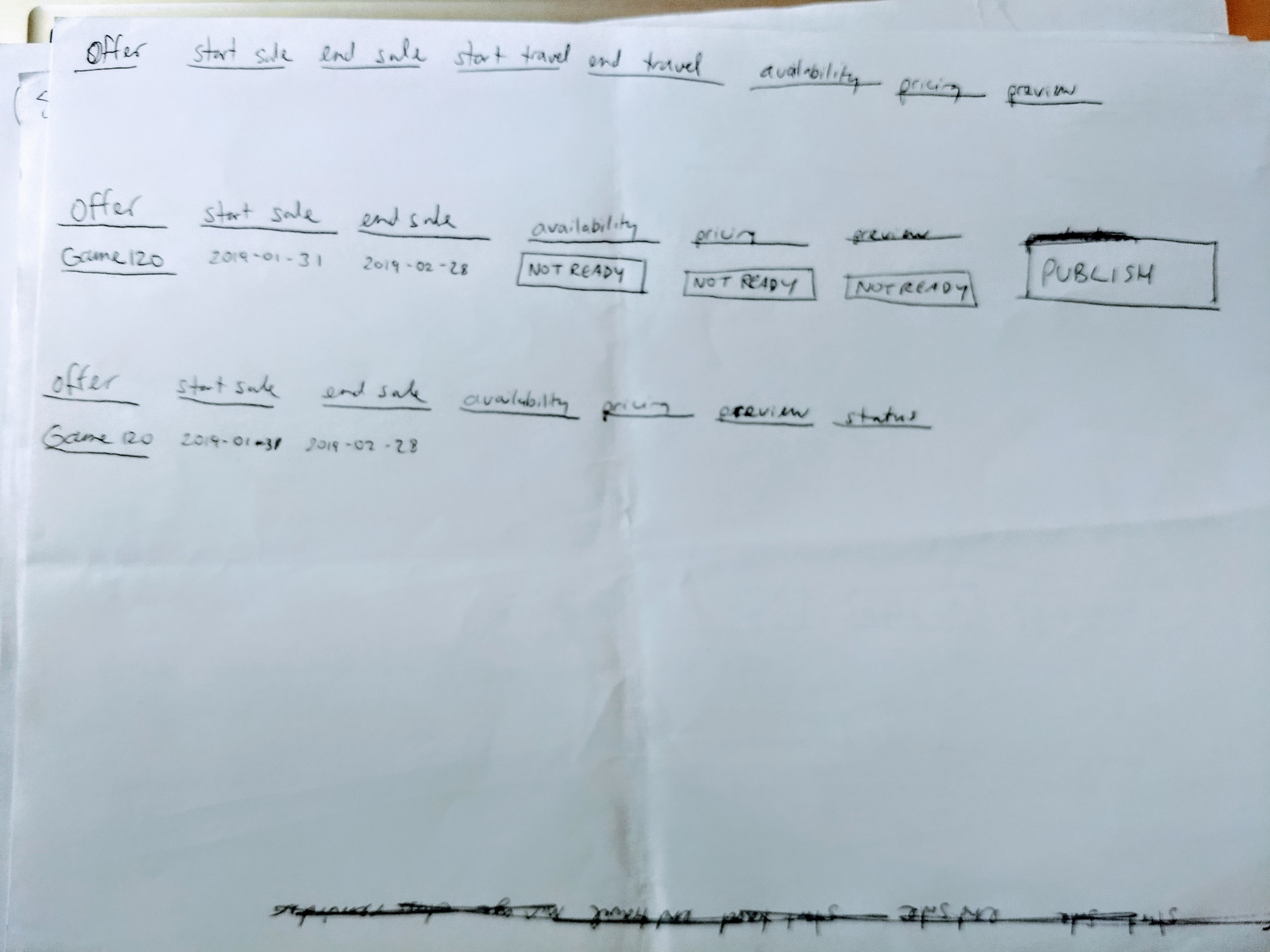
 Part of our sketching - exploring a simple dashboard for showing price upload status
The new dashboard saved the team time, but we wanted to take a a step back and rethink the process from the ground up so that it provided the ideal experience for everyone. So I ran workshops and co-design activities to establish existing patterns in pricing and sales reporting, and imagine how we could improve.
 Reporting needs - click to zoom
 Existing reporting process - click to zoom
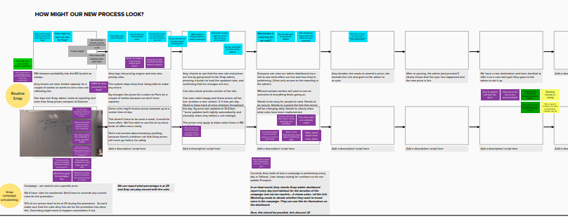 Part of our ‘new process’ workshop - click to zoom
Through my work, I identified patterns for pricing and sales reporting that were common across all of Eurostar, not just Eurostar Snap. I designed a new Snap pricing and reporting interface in close collaboration with pricing and developer colleagues, and worked to ensure that other areas of the business were aware of our work and could share our patterns.
Want to see wireframes of the new admin interface? Get in touch.
Case studies
Case studies