‘Habit-forming’ at the Guardian
The problem
The Guardian wanted to increase visit frequency in a bid to drive loyalty and encourage new subscribers. The organisation had a big hypothesis: if we could get occasional visitors hooked on a weekly ‘series’ (like Inspect a Gadget and Experience), they would return more frequently and develop a Guardian habit.
I was brought in as UX lead on a new product team tasked with using series content to drive habit. I was skeptical, however. The ‘series’ hypothesis had been explored a bit already, but definitely hadn’t been validated. What if there was something else that would be better at helping people form a reading habit?
The outcome
I led the team through a discovery phase where, over one quarter, we rapidly tested around 20 concepts aimed at helping Guardian readers form a lasting habit.
We quickly discovered our original hypothesis was incorrect, and went on to uncover and validate a new opportunity to pursue: our concepts that pushed ‘relevance’ resonated with readers.
The discovery phase kickstarted a continuous discovery track on our team. We went on to deliver two winning concepts - ‘Weekend Reading’ and ‘Recommended for you’; both hit our visit frequency metrics and went on to become paid features in the Guardian app. I put processes in place to ensure discovery would continue on the team as we delivered these features and other items in our backlog; I went on to teach other teams around the Guardian about how to adapt discovery and dual track agile to their teams, helping improve ways of working around the organization.
My process
Starting the discovery phase
I ran a kickoff for the new team, where we discussed the problem and decided on a hypothesis to use as the basis for brainstorming: “We believe that improving awareness of regular content for users on platform will encourage users to engage with that content and form a Guardian reading habit.”
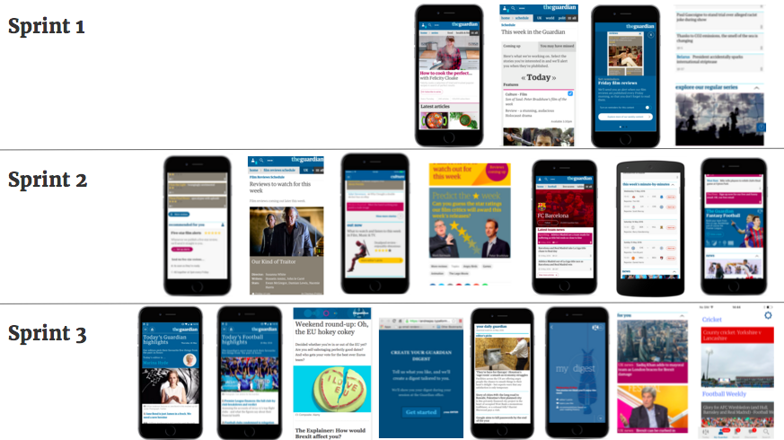
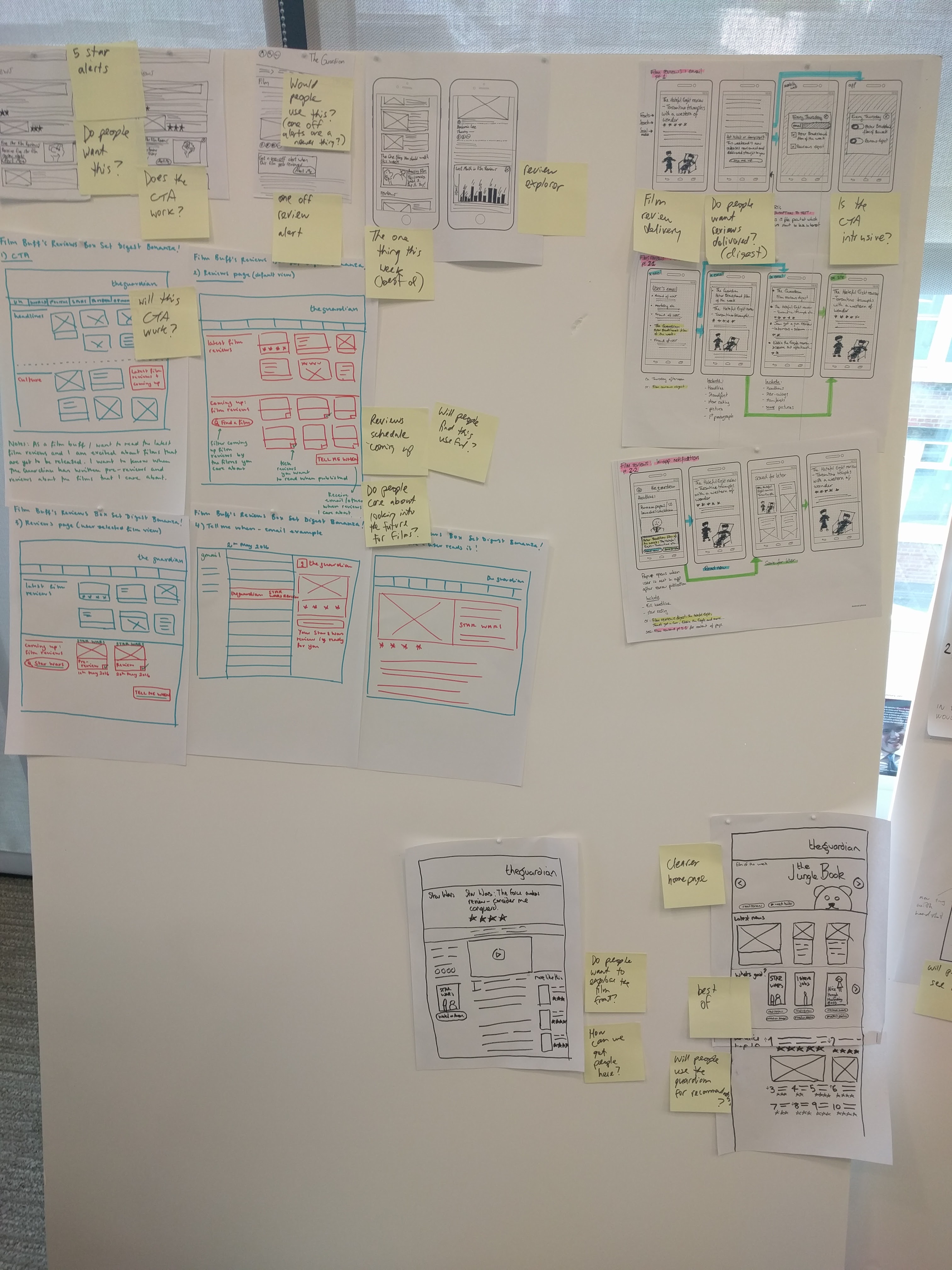
I grouped similar ideas into themes, and ranked them from ‘smaller’ to ‘bigger’ ideas. I encouraged the team to vote on their favourite ‘big’ ideas, to turn into prototypes to test with 10 users.

I then led the team through a mini design sprint where we rapidly created the prototypes together, using ‘design studios’ to sketch out the screens; a different team member then created each prototype using whatever tools they were comfortable with.
Each prototype was designed to test a number of our assumptions around how we could get users to engage with regular ‘series’ content.
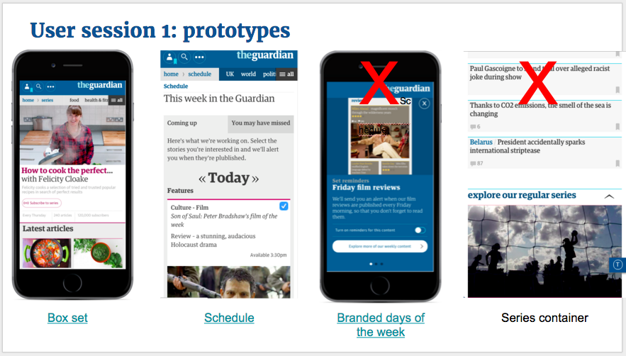
- “Box set”
- Will packaging up the content of a series or columnist into one engaging space encourage readers to get hooked on that series or columnist?
- Will the above encourage readers to sign up for alerts when a new item in the series is published?
- Would an ‘ask me anything’ Q&A feature with the series writer help get readers engaged with the series and encourage them to come back to read questions and answers?
- “Schedule”
- Will telling users what’s coming up on the Guardian later that day encourage readers to return to read these stories later in the day?
- Will readers sign up for alerts to be reminded about stories that are coming up?
- Would they like to specify their own delivery time for these?
- Will pointing readers to stories they might have missed yesterday encourage them to engage with more content?
- “Branded day of the week”
- Will associating different types of content with different days of the week (eg Wednesday mid-week recipes, Film review Fridays), help readers build a habit of coming back on particular days of the week?
- “Series container”
- Do readers care if an article is part of a series?
- If we promote our series content in its own homepage container, will this help readers discover their new favourite series and get hooked?
- If we write an article containing editors’ picks for the most interesting stories on the Guardian this week that are part of a regular series, will that help get readers interested in our series content?
Following the user sessions, we took the parts of each prototype that had resonated the most with users, and turned them into ‘building blocks’ - promising themes that we could carry forward and remix into future propositions.
The biggest theme? Participants didn’t care whether a story was part of a ‘series’ or not - their goal was just to find stories that were relevant to them. This was a huge turning point for the team - we’d been barking up the wrong tree with ‘series’.
We also saw a lot of interest in having more control over emails and alerts from the Guardian, to ensure these were more relevant.
It now seemed that ‘relevance’, not ‘series’, was the opportunity we should be pursuing for helping people form a Guardian reading habit.
We ran two more design sprints, each time building on the big themes and ‘building blocks’ from the previous lab sessions, each time getting closer to the right products to drive habit.
Building on our learnings with our second design sprint
Because we now wanted to focus our efforts on ‘relevant content’ and ‘relevant alerts’, we created prototypes aimed at users who were interested in either film or football, working with the film and football editorial desks.


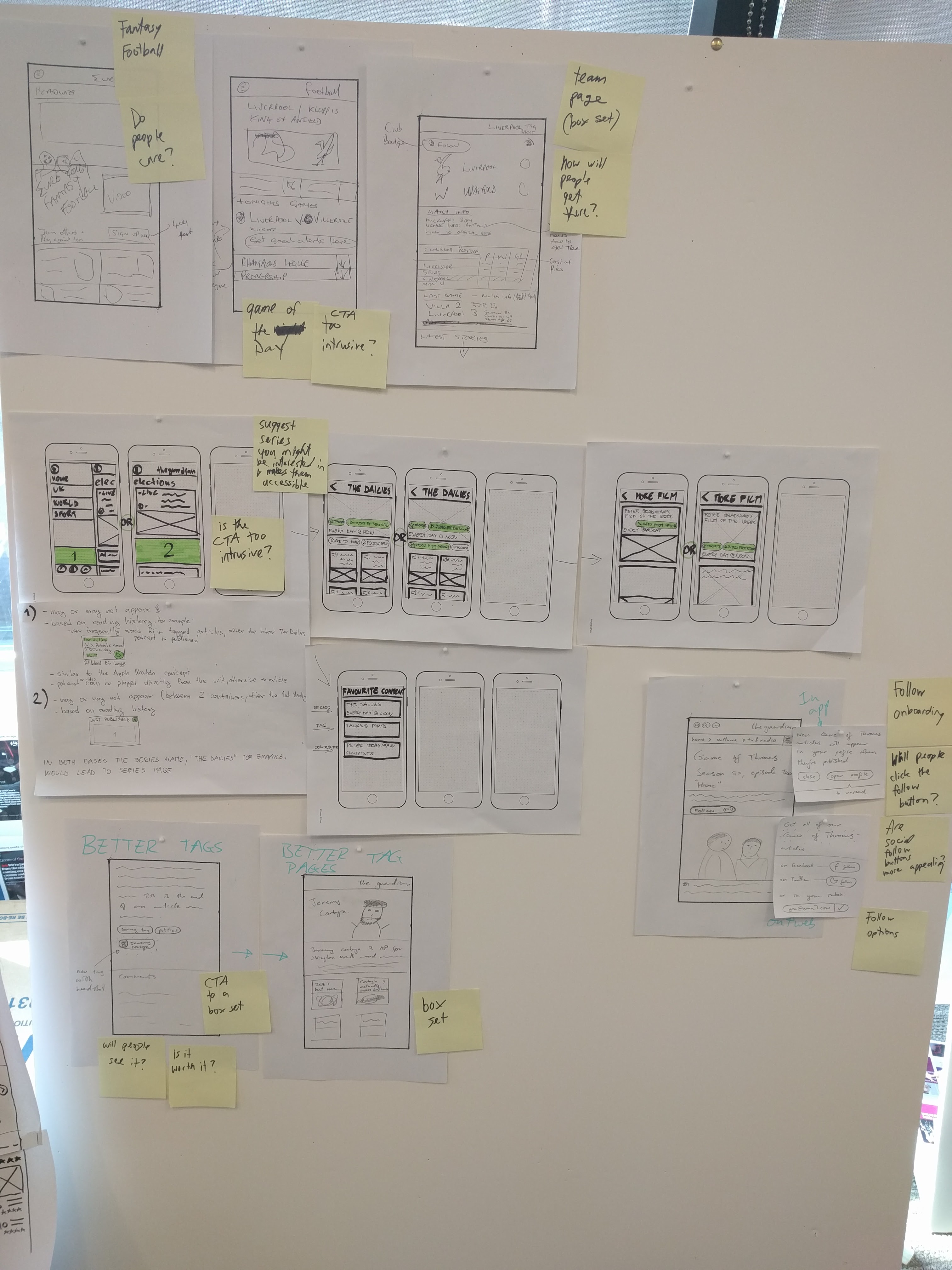
Concepts included:
- ‘Five star film review’ alerts where the user could control frequency
- ‘Create your own personalised film reviews digest’
- ‘What to watch and listen to this week’ picks from editors
- Look ahead to football matches this week, and sign up to be reminded about our live blog for matches of interest
- ‘Team box set’ - get all the news from your favourite team in one place, and sign up for alerts about your team
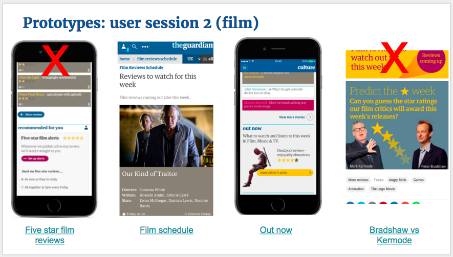

During the sessions we saw more interest in ‘relevant alerts’ - the idea of receiving alerts about specific topics of interest, with control over frequency. (There were strong signals that weekly reminders were a good cadence.) We also saw lots of love for culture picks curated by editors.
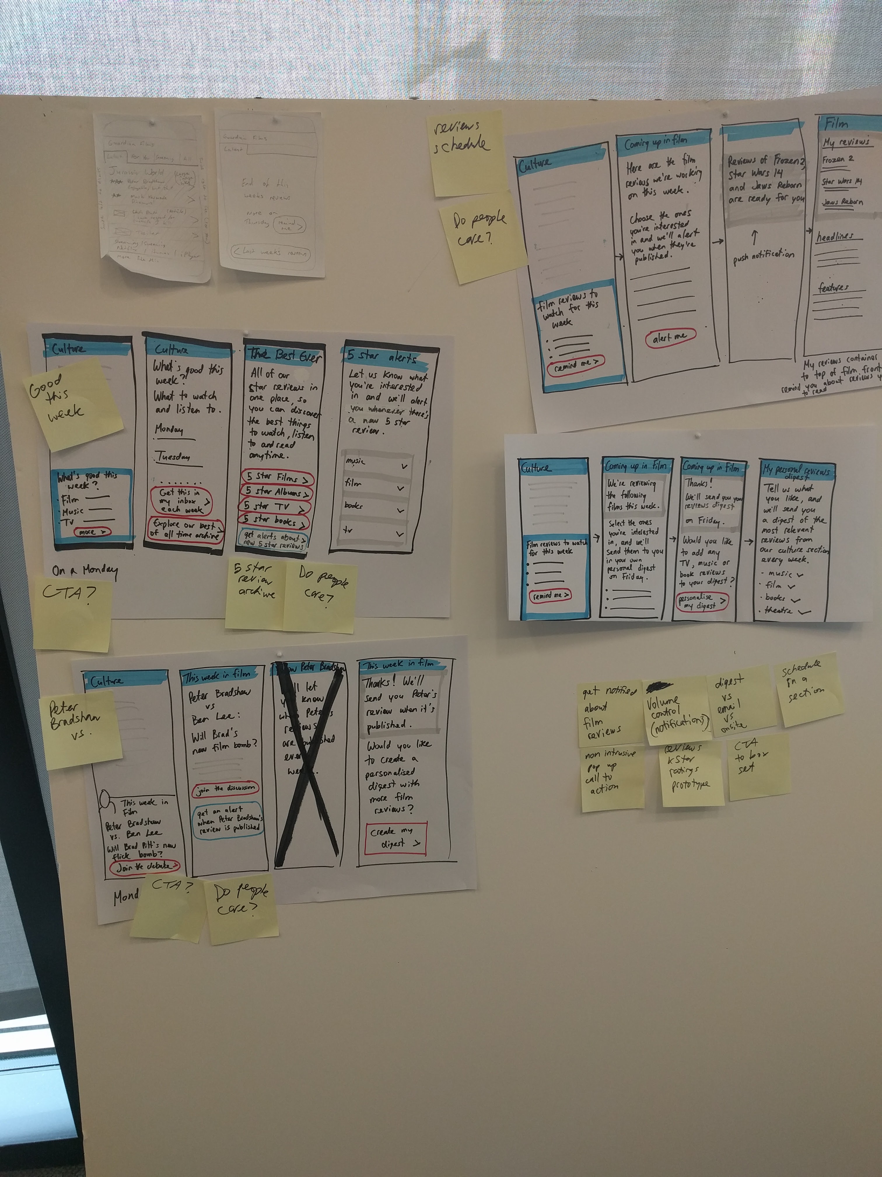
A third design sprint to explore the best of our ‘relevance’ concepts
Now interested in how we could best deliver collections of relevant content to users, and help them get into the habit of reading these, we remixed our previous learnings into the following concepts:
- A weekly set of ‘best reads for the weekend’, curated by editors and delivered by email
- A ‘tailored digest’ of content based on a user’s interests, delivered daily or weekly depending on their preference, by email or app push notification
- A daily collection of must reads from around the Guardian, curated by a different guest editor each day
- A daily collection of must-read football stories from the last 24 hours
- A homepage containing only top headlines and stories that are ‘recommended for you’ - on web and in app
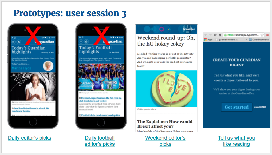

We brought the ‘personalised’ prototypes to life for each user with real content chosen for them based on their interests. We saw strong validation for a weekend supplement-style collection of editors’ picks, as well as the ‘tailored digest’ and homepage recommendations concepts.
Keeping our design sprint learnings alive
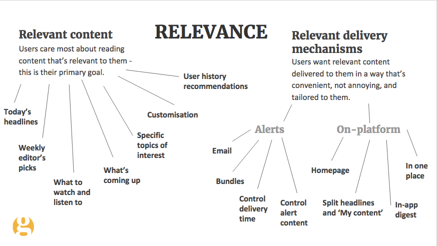
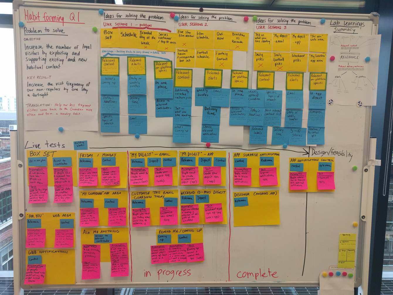
I summed up the learnings from all three design sprints into a visual showing our big opportunities for habit-forming going forward, and all the ‘building blocks’ that showed promise for remixing into future ideas. I wanted all of our learnings to stay front of mind on the team, and this illustration has helped with that.
Live experiments to validate our most promising concepts with more data
I ran an ‘assumptions and tests’ workshop with the team, to help us design the leanest possible live demand tests to help us determine which of our most promising concepts would be most worth building.
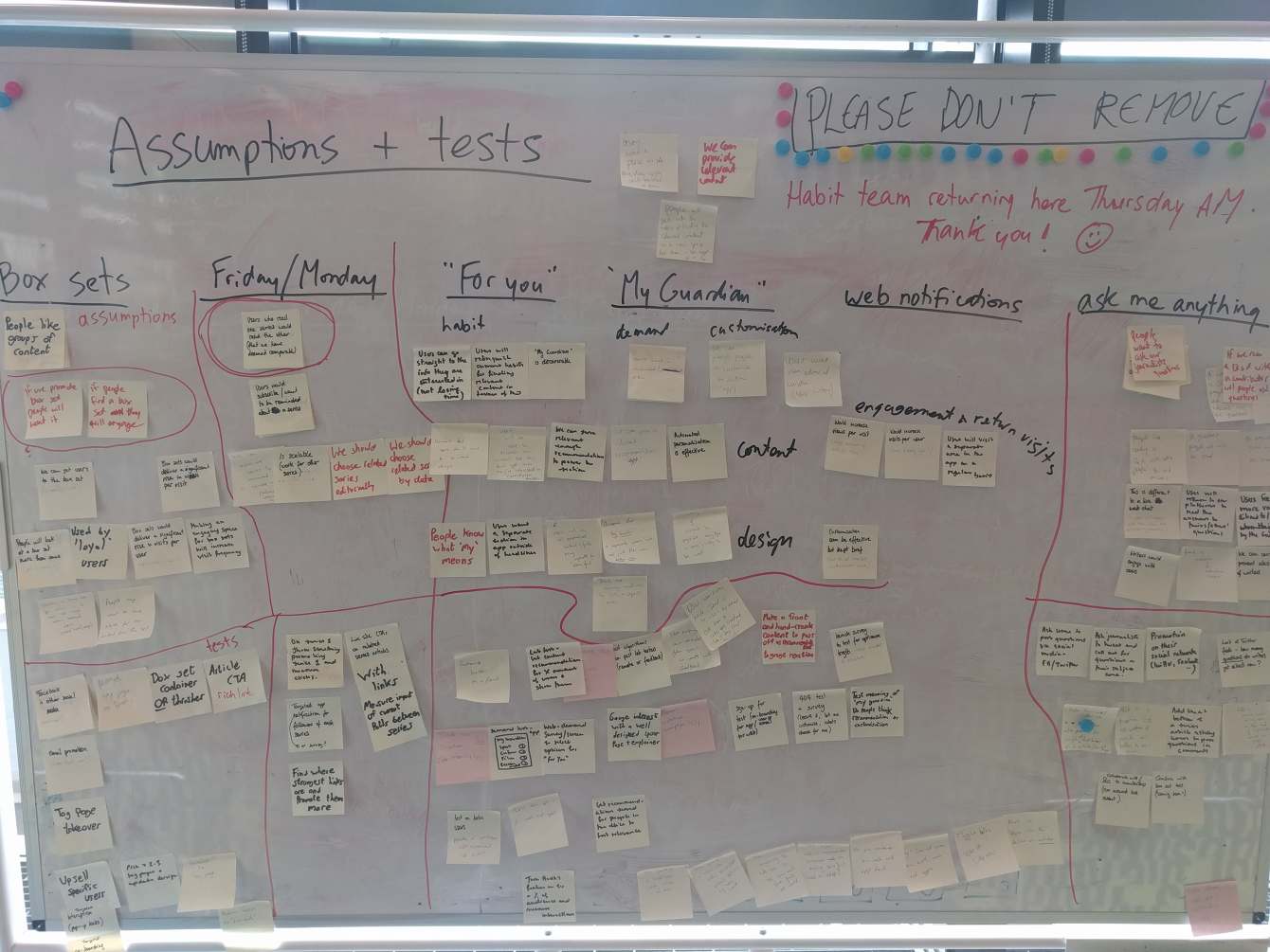
To keep track of our many experiments, I worked with the team to created a board with ‘experiment cards’. Each contained the feature name, assumption we were testing and the test - as well as the research ‘building blocks’ that had led to the test. This was invaluable when it came to helping team members remember why we were running each experiment, as well as getting new team members up to speed.
Our winning concepts
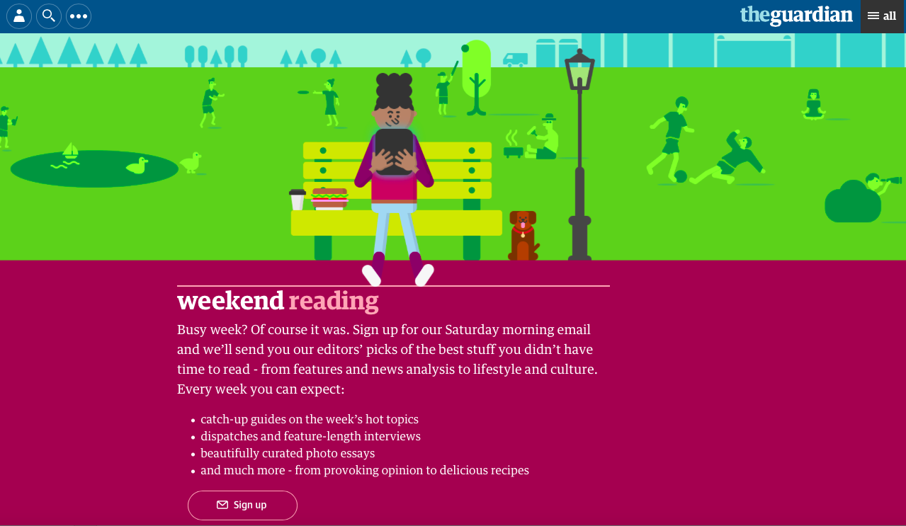
Of all of our demand tests, ‘Weekend reading’ (editors’ picks for the best weekend reads, delivered by email or in-app), and ‘Recommended for you’ (a container of user history recommendations on the homepage) performed the best.
I refined both of these features through detailed design, usability testing and beta testing, validating our big assumptions till launch and beyond. Here’s what that process looked like for Weekend Reading:
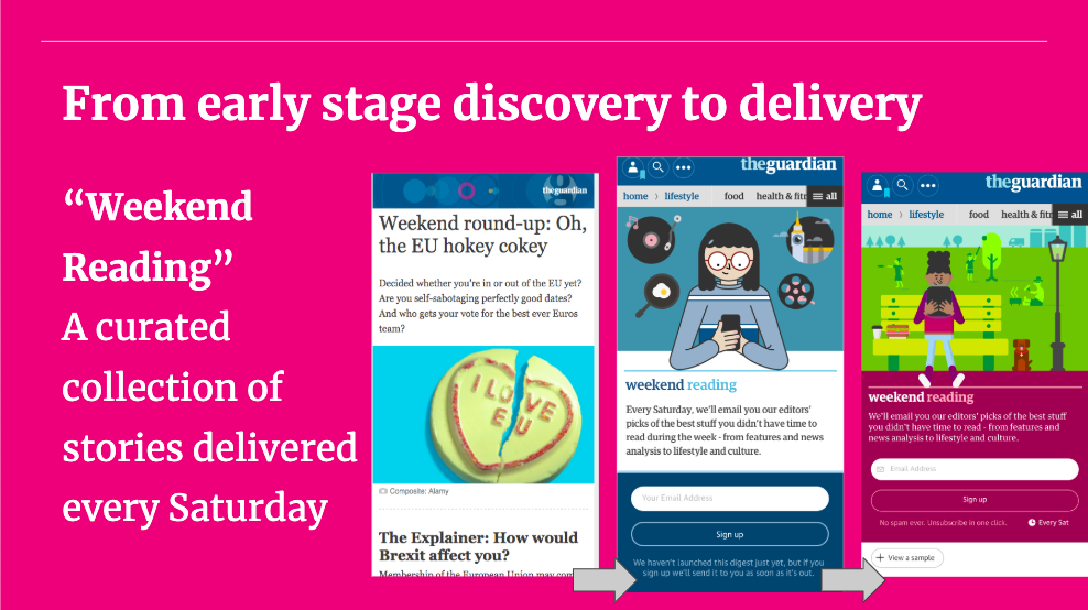

The team delivered both features, and both successfully hit our metrics early on: ‘Weekend reading’ resulted in an extra 140k visits/month to our app, while ‘Recommend for you’ has moved the Guardian’s visit frequency metric - the first time this has happened since the introduction of breaking news alerts.

Iterating and learning doesn’t stop
The team continued to optimise ‘Weekend reading’, running further tests and experimenting with content.
I also led further discovery to build on the success of ‘Recommended for you’. I ran another design sprint focussed on ‘the most relevant on-platform experience’, looking at big concepts for how we could make the Guardian as relevant as possible; our best performing concepts landed with editorial, who have continued to explore them.
I also led user research to improve the quality of the Guardian’s user history recommendations algorithm, working closely with a tech lead. This work led to a number of learnings and suggestions that have continued to be used at the Guardian even after my departure, and can be seen in the Guardian app team’s recommendations work.
Case studies
Case studies